
Shopify website examples are the fastest way to reverse-engineer what a great online store looks like. Instead of guessing what your storefront needs, you can study stores that already convert — and borrow the patterns that make them work. We rounded up 15 of the best Shopify websites on the web right now, from global DTC giants to a beloved Seattle market shop, and broke down exactly what each one does well.
What makes a great Shopify website example?
The best Shopify stores share a few traits: a hero that states what you sell in one glance, big product photography, friction-free add-to-cart flows, and trust signals (reviews, guarantees, press) placed right where hesitation happens. As you browse this list, watch for those four things — they're the difference between a store that looks nice and a store that sells.
1. Allbirds — calm, confident simplicity
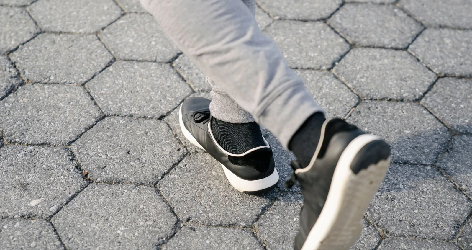
Allbirds proves that restraint sells. One hero product, one sentence of copy, one button. The entire homepage funnels you toward a single decision, and the sustainable-materials story is woven into every section without ever shouting.
What makes it work:
- A single hero product with a one-line value proposition
- A sustainable-materials story woven into every section
- One primary call to action, repeated down the page
2. Gymshark — community as a design system

Gymshark treats its storefront like a media brand. Athlete photography, social proof, and drop-based merchandising create urgency, while lightning-fast collection pages keep the huge catalog easy to shop.
What makes it work:
- Athlete photography and social proof on every surface
- Drop-based merchandising that creates urgency
- Fast, filter-heavy collection pages for a huge catalog
3. Simple Life Seattle — a famous Pike Place Market shop, online and in-store
Simple Life Seattle is the custom storefront for a famous physical store at Seattle's Pike Place Market — and it's a Vibe Otter design. What makes it one of the most interesting Shopify website examples on this list is how completely it unifies the physical and digital sides of the business:
- Unified in-store and ecommerce functions — the online catalog mirrors what's actually on the shop's shelves, so browsing online feels like walking the store.
- Booking built in — customers can book appointments and experiences directly from the site, turning walk-in traffic and web traffic into one pipeline.
- Local storytelling — the design leans into the market's character instead of a generic template, which is exactly what a destination store needs.
If you run a brick-and-mortar shop and wonder whether a real storefront site is worth it, this is your answer. Visit Simple Life Seattle to see it live.

4. Beardbrand — content that earns the sale

Beardbrand built an empire on grooming education, and the store reflects it. Editorial layouts, video embeds, and a strong brand voice make browsing feel like reading a magazine that happens to have a cart.
What makes it work:
- Editorial layouts and video content that earn trust
- A strong, consistent brand voice
- Education that leads naturally into product pages
5. Death Wish Coffee — bold brand, bolder conversion design

Death Wish Coffee commits fully to its identity. Dark palettes, punchy claims, and a risk-free guarantee up front show how a strong point of view can carry an entire shopping experience.
What makes it work:
- A dark, punchy visual identity carried through every page
- The risk-free guarantee placed right at the decision point
- Bold claims backed by reviews and press badges
6. MVMT — minimal product pages that move fast
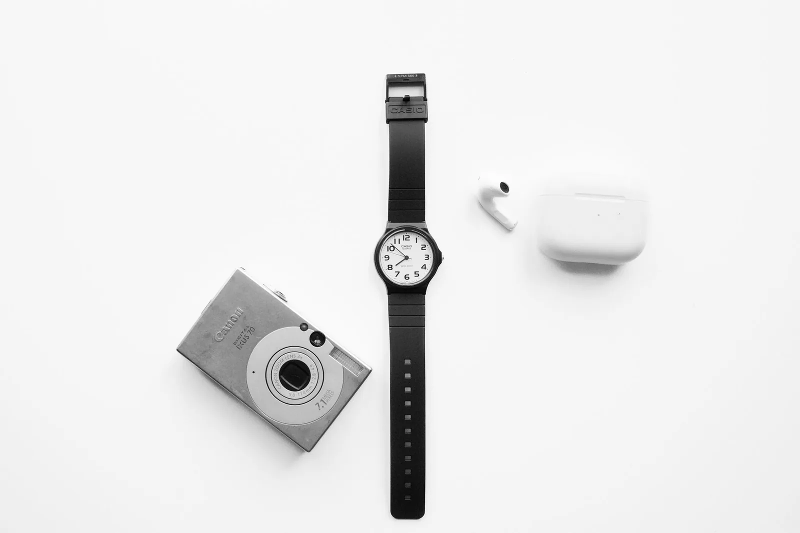
MVMT keeps product pages ruthlessly clean: large imagery, sticky add-to-cart, and reviews within a thumb's scroll. It's a masterclass in removing friction from a purchase.
What makes it work:
- Large imagery with a sticky add-to-cart
- Reviews within a thumb's scroll of the buy button
- Zero-distraction layouts that keep momentum toward checkout
7. Chubbies — personality in every pixel

Chubbies is proof that humor converts. Playful copy and irreverent photography give the brand a voice, while the underlying Shopify architecture stays disciplined: clear collections, quick shop, easy checkout.
What makes it work:
- Playful copy that gives the brand a voice
- Irreverent photography that stands out in the feed
- Disciplined Shopify architecture underneath the fun
8. Steve Madden — a big catalog that still feels personal

Steve Madden handles thousands of SKUs with smart filtering, wishlist functionality, and a mobile experience that puts shopping front and center. Great example for anyone with a large product line.
What makes it work:
- Smart filtering and search across thousands of SKUs
- Wishlist functionality that feeds retargeting
- A mobile experience that puts shopping first
9. Fashion Nova — speed and social proof at scale

Fashion Nova leans hard into urgency: new-drop banners, review counts on every card, and Instagram-style imagery throughout. It's built for the scroll-and-buy shopper.
What makes it work:
- New-drop banners that create constant urgency
- Review counts on every product card
- Instagram-style imagery that feels native to social traffic
10. Partake Foods — accessibility as a selling point
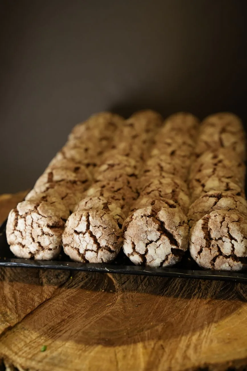
Partake Foods leads with its allergy-friendly promise right in the hero, uses warm approachable design, and keeps ingredient transparency one click from every product. Niche brands, take notes.
What makes it work:
- The allergy-friendly promise stated right in the hero
- Warm, approachable design that matches the mission
- Ingredient transparency one click from every product
11. Red Bull — a storefront that's really a media hub

Red Bull shows how far you can push Shopify beyond products — events, editorial, and merch all live together. Useful inspiration if your brand is bigger than its catalog.
What makes it work:
- Events, editorial, and merch living in one ecosystem
- Content that builds the brand beyond the catalog
- A seamless path from story to shop
12. Brooklinen — education right before the buy button

Brooklinen answers objections in place: fabric comparisons, care guides, and a 100-night trial appear exactly where a shopper would hesitate. A great pattern for considered purchases.
What makes it work:
- Fabric comparisons and care guides placed in context
- The 100-night trial shown at the moment of hesitation
- Education that removes risk from a considered purchase
13. Taylor Stitch — built to last, designed to last
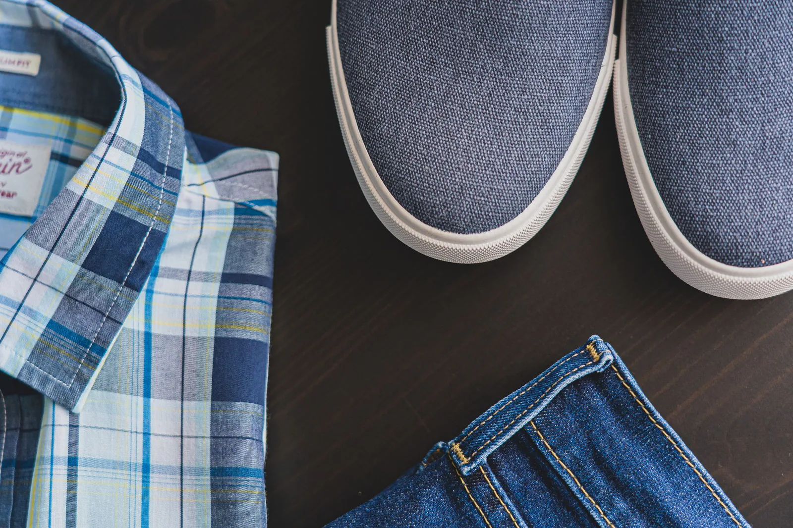
Taylor Stitch combines rich storytelling with practical tools like fit finders and shop-pay prompts. The product pages balance craft narrative with hard specs better than almost any store online.
What makes it work:
- Rich storytelling paired with practical fit finders
- Product pages that balance narrative and specifications
- Shop-pay prompts placed exactly where checkout friction happens
14. Haus — one product, done perfectly

Haus sells a tiny catalog with enormous care: a single-page flow, beautiful bottle photography, and a subscribe-and-save path that's impossible to miss. Proof that focus beats breadth.
What makes it work:
- A single-page purchase flow with zero detours
- Beautiful bottle photography doing the selling
- A subscribe-and-save path that's impossible to miss
15. Kylie Cosmetics — launches as events
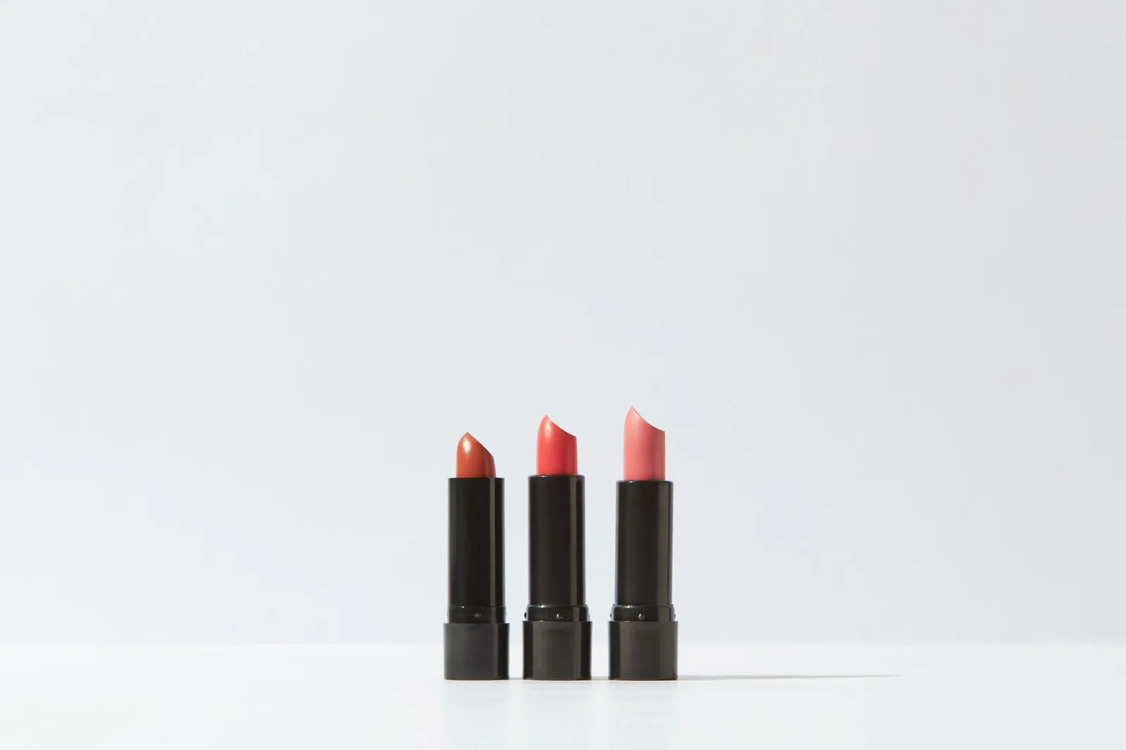
Kylie Cosmetics treats every product drop like a premiere — countdowns, restock alerts, and a checkout flow tuned for massive traffic spikes. The best example of Shopify handling celebrity-scale demand.
What makes it work:
- Countdowns and restock alerts that build hype
- A checkout flow tuned for massive traffic spikes
- Launch mechanics that turn products into events
What these Shopify website examples teach you
- Clarity beats cleverness. Every store above tells you what it sells within one screen.
- Photography is the interface. The product image does most of the selling.
- Trust signals belong mid-page, not hidden in the footer.
- Online and offline can be one business — Simple Life Seattle shows how a physical store and its Shopify storefront reinforce each other.
Starting from zero instead of scaling a store? You don't need a big budget to get your first site live. One cleaning business used Vibe Otter's bộ công cụ khởi nghiệp kinh doanh vệ sinh (cleaning business launch kit) to get started — a single kit that took them from no website to a booked-out calendar. If Shopify examples show you what a finished store looks like, a launch kit shows you how to get there.